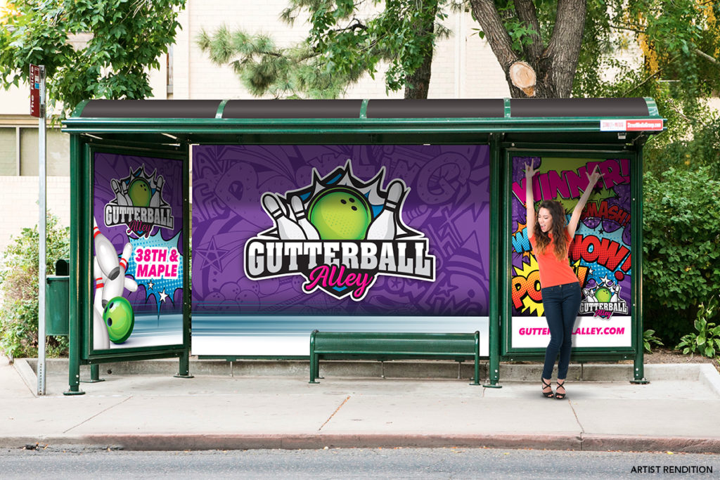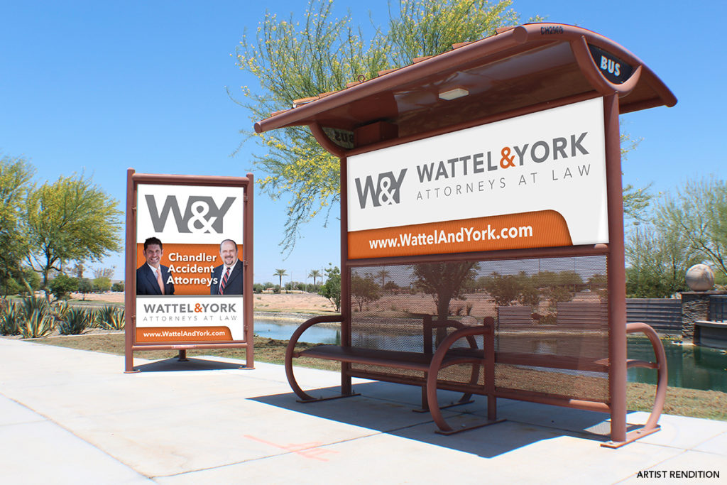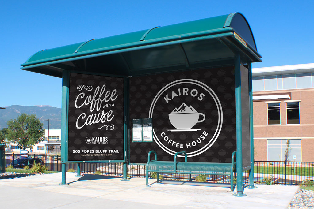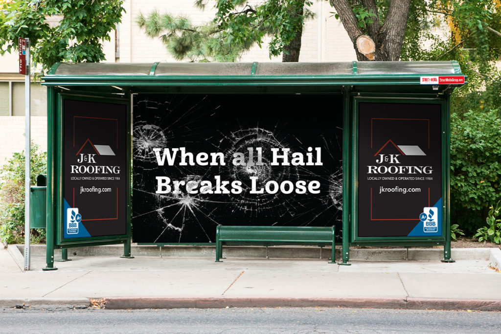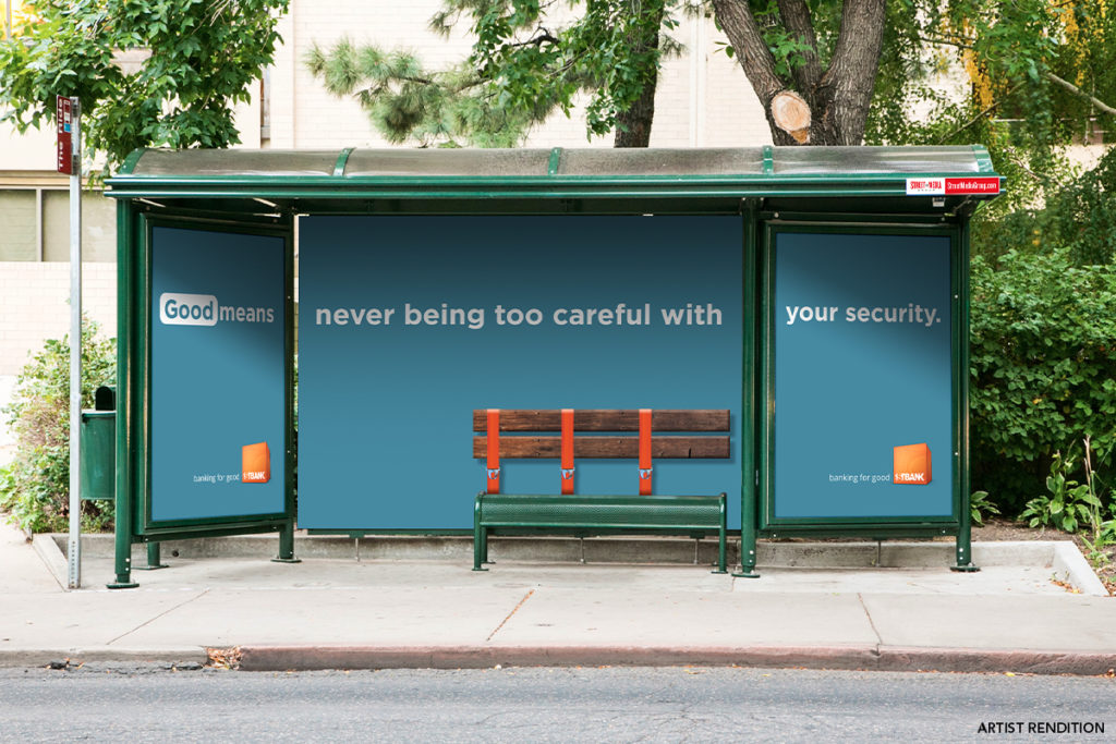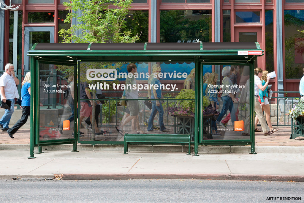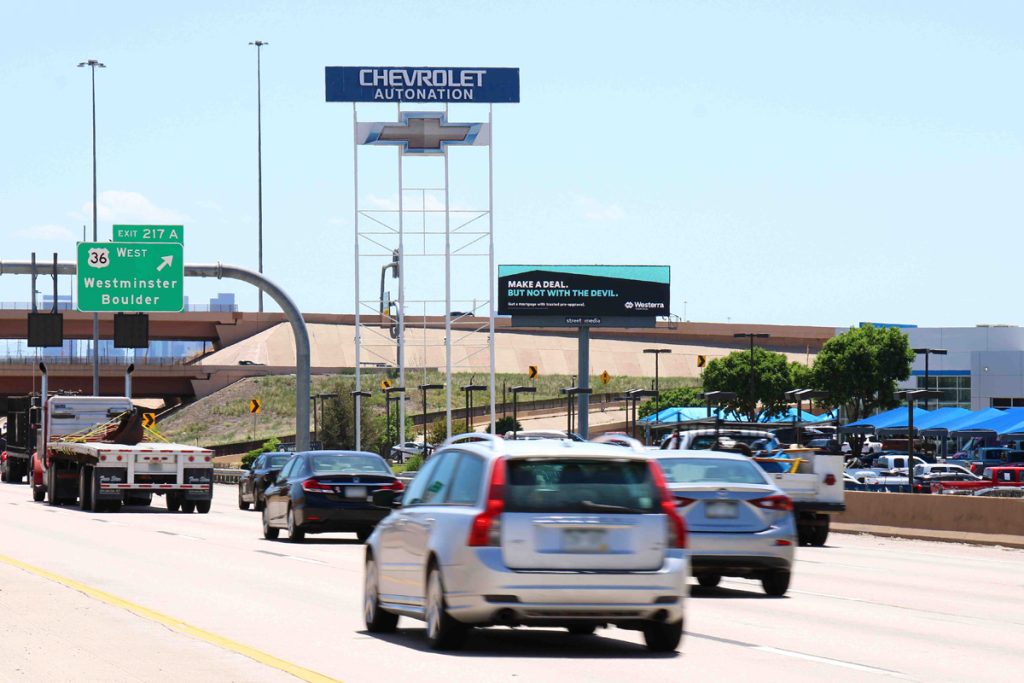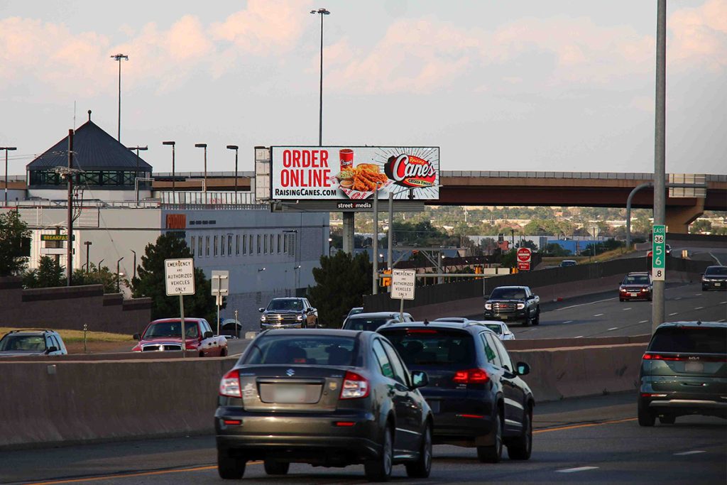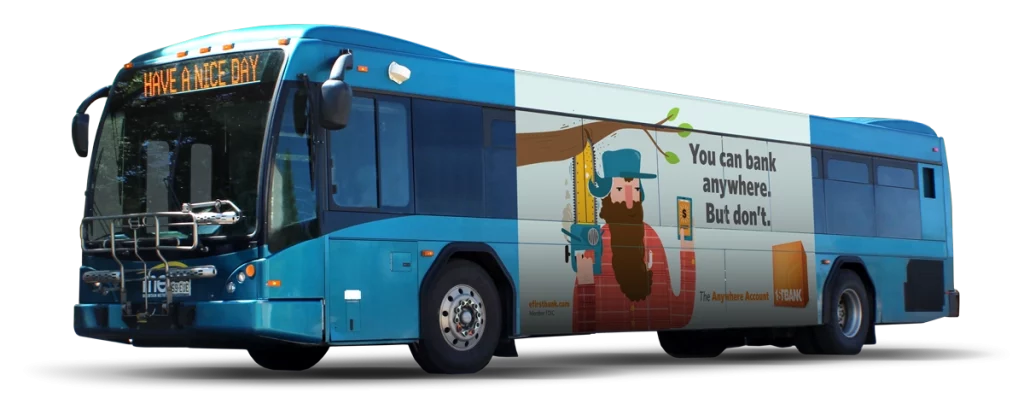
Our bus ads roll through the major transit arteries of our hand-picked cities, demanding attention as they promote your message to motivated consumers every day. Bus advertising is an effective and low-cost medium that delivers extraordinary frequency. This builds brand awareness and keeps you top-of-mind with potential customers. With a wide range of sizing options, we can offer the right bus ad for any budget.
Why bus advertising is right for your business.
According to the Nielsen Out-Of-Home Advertising Study, 78% of those surveyed have noticed transit advertising in the past month. 55% of U.S. residents age 16 or older surveyed noticed ads on the side of public buses in the past month, and 64% noticed a wrapped vehicle advertisement in the past month. Those are some significant numbers considering 80% of those surveyed engaged with some sort of transit advertising.
Bus ads deliver your message to a steady flow of consumers, serving as rolling billboards on the busiest streets throughout the city. Their large, bold advertising space demands maximum attention from a growing audience.
Exposure: Buses travel fixed routes throughout cities and communities, providing great exposure for ads in high-traffic areas.
Targeted Reach: Bus route advertising allows advertisers to target specific demographic groups and neighborhoods.
Frequency: Commuters and a wide range of consumers in the marketplace see bus ads multiple times as buses pass regularly. This provides repetitive impressions.
Low Cost: Bus ads are an affordable form of out-of-home advertising compared to other media like TV, radio, and billboards. Cost per thousand impressions is low.
Flexible Use: Choose from a variety of ad sizes and different placement locations on the bus that fit your advertising goals and budget.
Captive Audience: Riders are a captive audience, giving them time to engage with interior bus ads during their commute.
Brand Awareness: Highly visible exterior bus ads help increase brand visibility and recognition.
Support Sales: Bus ads can drive consumers to take action and support both online and offline sales.
Creativity: Buses enable brands to execute creative and interactive ad campaigns that grab attention.
Overall, bus advertising offers brands a flexible, targeted, and cost-efficient out-of-home advertising medium to reach motivated consumers while they’re in the marketplace. Buses canvas communities and entire roadway systems, consistently capturing a wide range of demographics.
StreetMedia's bus advertising options.
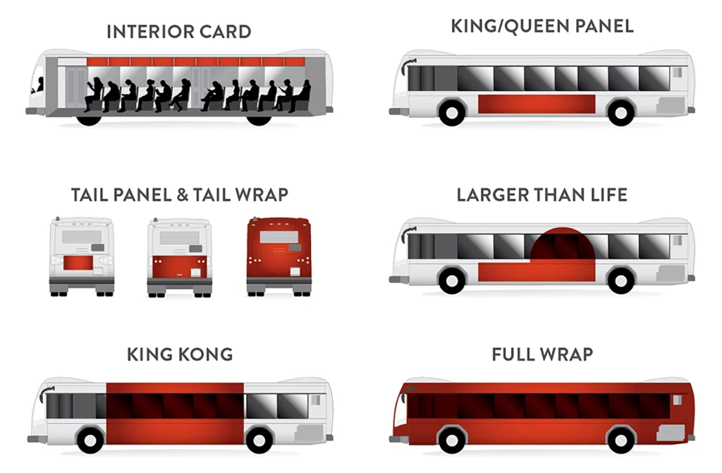
One of the many advantages of bus advertising is the wide range of options. These giant rolling billboards offer advertisers the ability to reach specific demographics both inside and outside the bus. Choose a curb side placement to target large groups of bus riders and pedestrians in busy tourist destinations, or street side and tail ads with constant exposure to traffic on busy roadways. Standard sized bus panel ads are very efficient and budget-friendly, or make a splash with oversized options that demand attention everywhere they go.
Interior Bus Cards
Interior bus cards are an incredible way to promote your message to a captive audience, often consisting of motivated tourists. With strong ridership throughout our robust bus fleets, your message will be consistently seen by highly sought-after demographics.
Standard card size: 11 in. x 28 in.
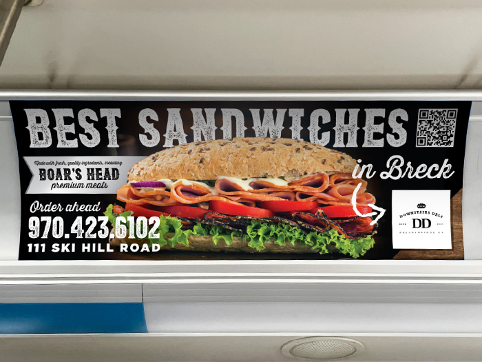
Breckenridge Interior Domination Package
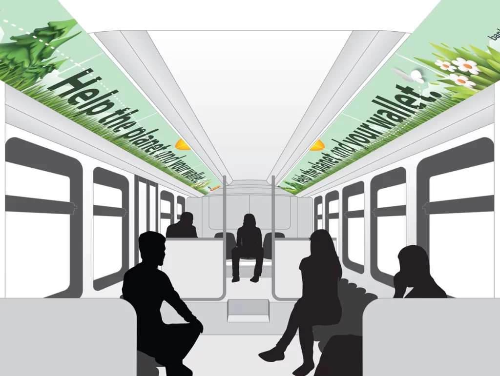
Two rows of six continuous ads run along the top interior of Breckenridge’s electric bus fleet, creating a unique and dynamic advertising space. This opportunity offers exclusivity, allowing your message to capture the attention of the audience without competition from other advertisers.
Breckenridge Domination card size: 14.5 in. x 44 in. Twelve cards total per bus.
Standard Bus Panels: Kings & Queens
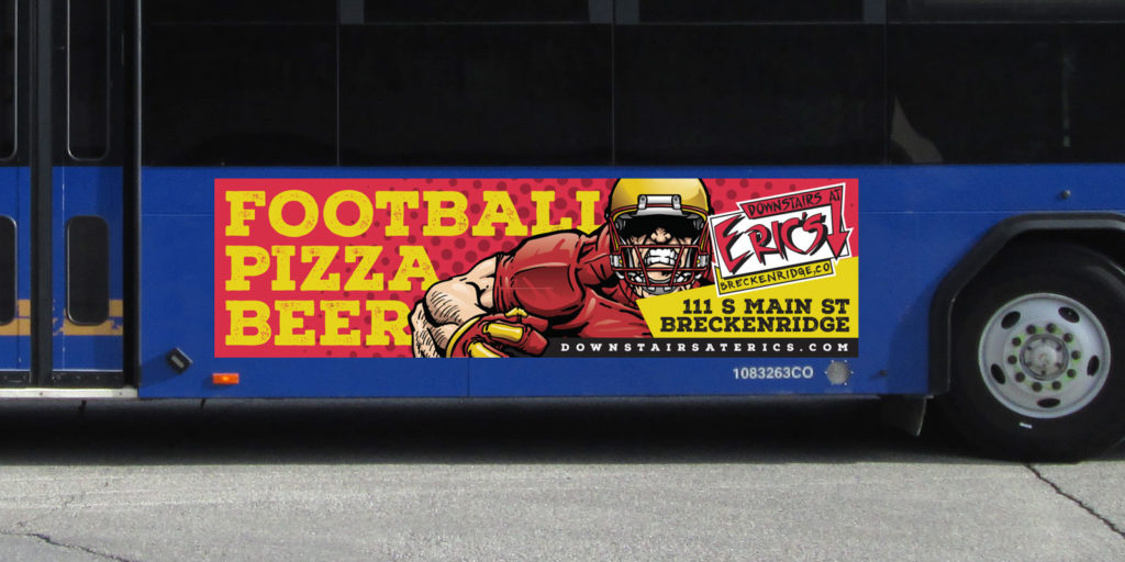
These large rectangular ads fill the prime advertising space below the windows and can be placed on both the street side and curb side of our buses. Considered by many to be the most efficient way to gain attention and promote a message, bus Kings and Queens should absolutely be a part of every marketing strategy.
Standard King Size: 30 in. x 188 in., 30 in. x 144 in.
Standard Queen Size: 30 in. x 88 in.
Standard Tail Panels
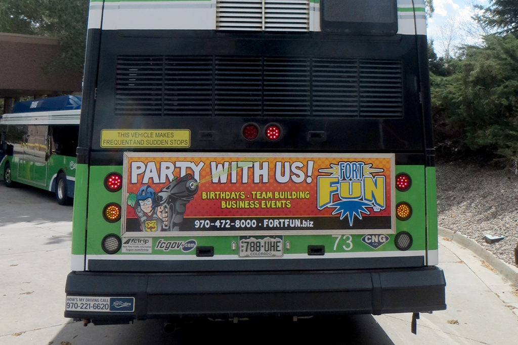
Bus tails offer highly visible advertising opportunities on a very dynamic space. They also offer options. Ranging from smaller rectangular ads to rear door wraps to full tail wraps, we have the right solution to fit your advertising goals and budget. Make a big impression on thousands of commuters every day.
Standard Tail Panel Sizes: 21 in. x 72 in., 21 in. x 50 in., 18 in. x 56 in.
Mountain Tails
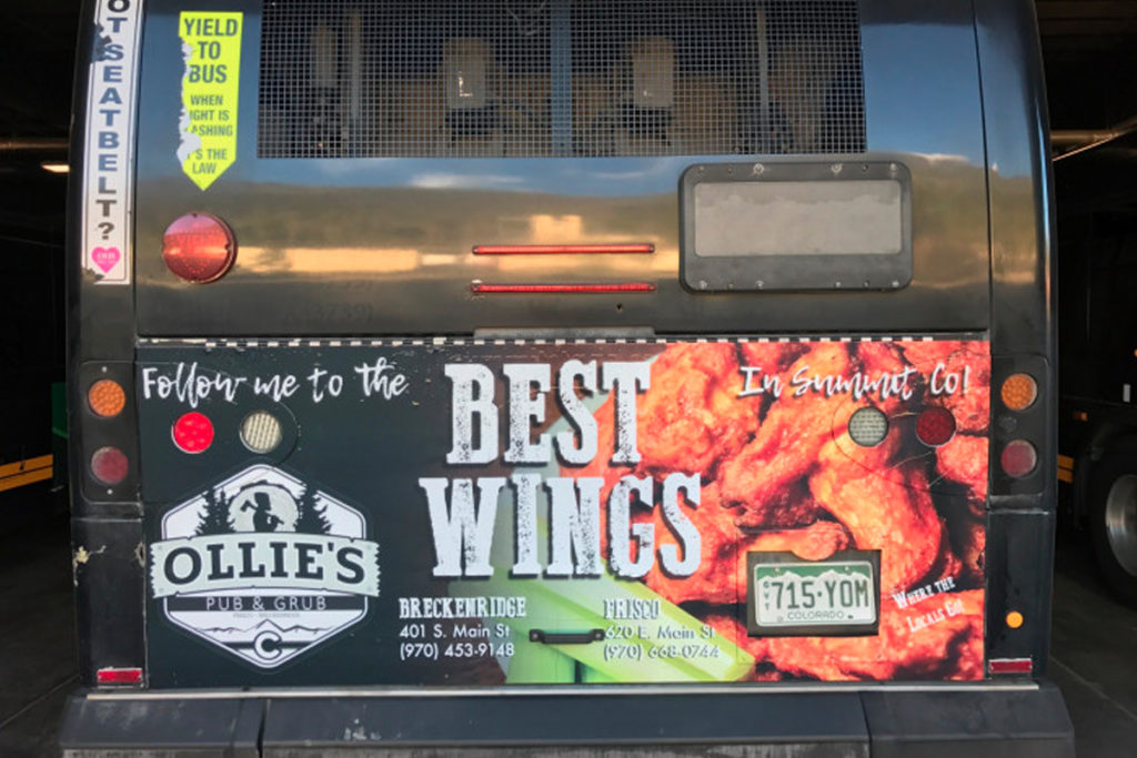
This option expands the standardized space of a typical tail panel ad, custom-fitting the rear panel of the bus. Ads stretch across bus features, like lights, reflectors, handles, etc.. This creates an attractive custom look that brings extra emphasis to your ad.
Mountain Tail sizes are custom designed to fit the specific buses to which they’re assigned.
Full Tail Wraps
Full Tail Wraps offer advertisers every square inch of space available on a bus tail. Images and messaging can span across large areas of this highly-viewed side of the bus to grab maximum attention.
Full Tail Wrap sizes are custom designed to fit the specific buses to which they’re assigned.
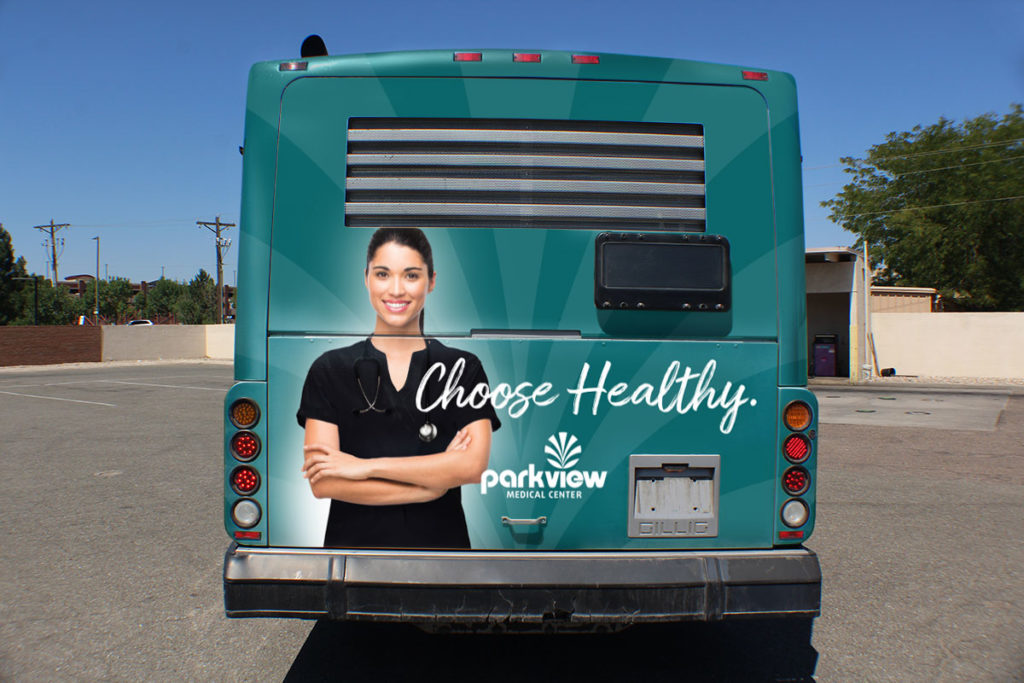
Larger Than Life
Think outside the box with our custom Larger Than Life option. This product utilizes the standard King or Queen bus panel space, then takes it to a whole new level with additional graphics. This is a perfect way to break the mold and draw extra attention to your message. Creativity is the key, and the possibilities are endless.
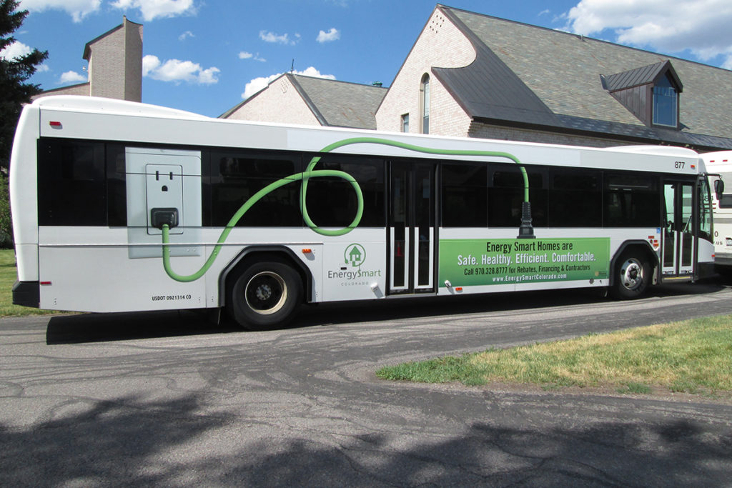
King Kong
Take the city by storm with a custom oversized King Kong bus advertisement. Canvassing all of the available advertising space between the front and rear wheels of the bus, our King Kongs deliver ENORMOUS impact. Reach thousands of consumers every day as your message makes its way through the most populated areas of the market.
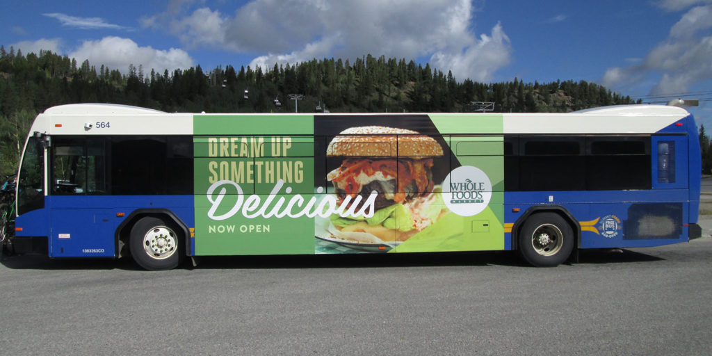
Full Wrap
For those who settle for nothing less than the greatest possible impact, introducing our full bus wraps. Covering every square inch of available advertising area on city buses, our full bus wraps demand maximum attention. Highly motivated consumers are sure to notice your message every day as it travels through the most populated areas of the market.

Bus Advertising in Colorado's Ski Resorts
We offer advertising on over 75 buses that circulate throughout Colorado’s most popular mountain resort destinations every day. Present your message to an audience that includes over 6.4 million annual visitors at Loveland, Arapahoe Basin, Keystone, Breckenridge, Copper Mountain, Vail, and Beaver Creek ski resorts. With widespread coverage among five of the top ten most visited ski areas in the country, your advertisement is sure to make a big impression on millions of motivated consumers.
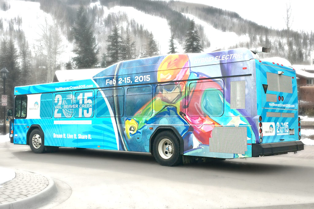
Summit County Bus Advertising
Home to world-famous ski destinations like Loveland Ski Area, Arapahoe Basin, Keystone, Breckenridge, and Copper Mountain, our bus ads in Summit County deliver consistent exposure to incredible demographics. Millions of tourists also see our ads rolling through surrounding areas, such as Dillon, Silverthorne, and Frisco. These tourists are primed to spend and our bus ads reach them while they’re in the marketplace.
Colorado’s ski country is far from a seasonal attraction, offering year-round adventures like hiking, cycling, climbing, shopping, dining, skiing, snowboarding, cross-country skiing, snowshoeing, snowmobiling, dog sledding, and fun parks. Lake Dillon and the Blue River are popular attractions that provide plenty of fun for paddle boarding, boating, and fishing. Tourism also fuels thriving industries in restaurants, breweries, distilleries, shopping, art galleries, gift shops, sports outfitters, and boutiques.
StreetMedia's Bus Advertising Coverage Through Summit County
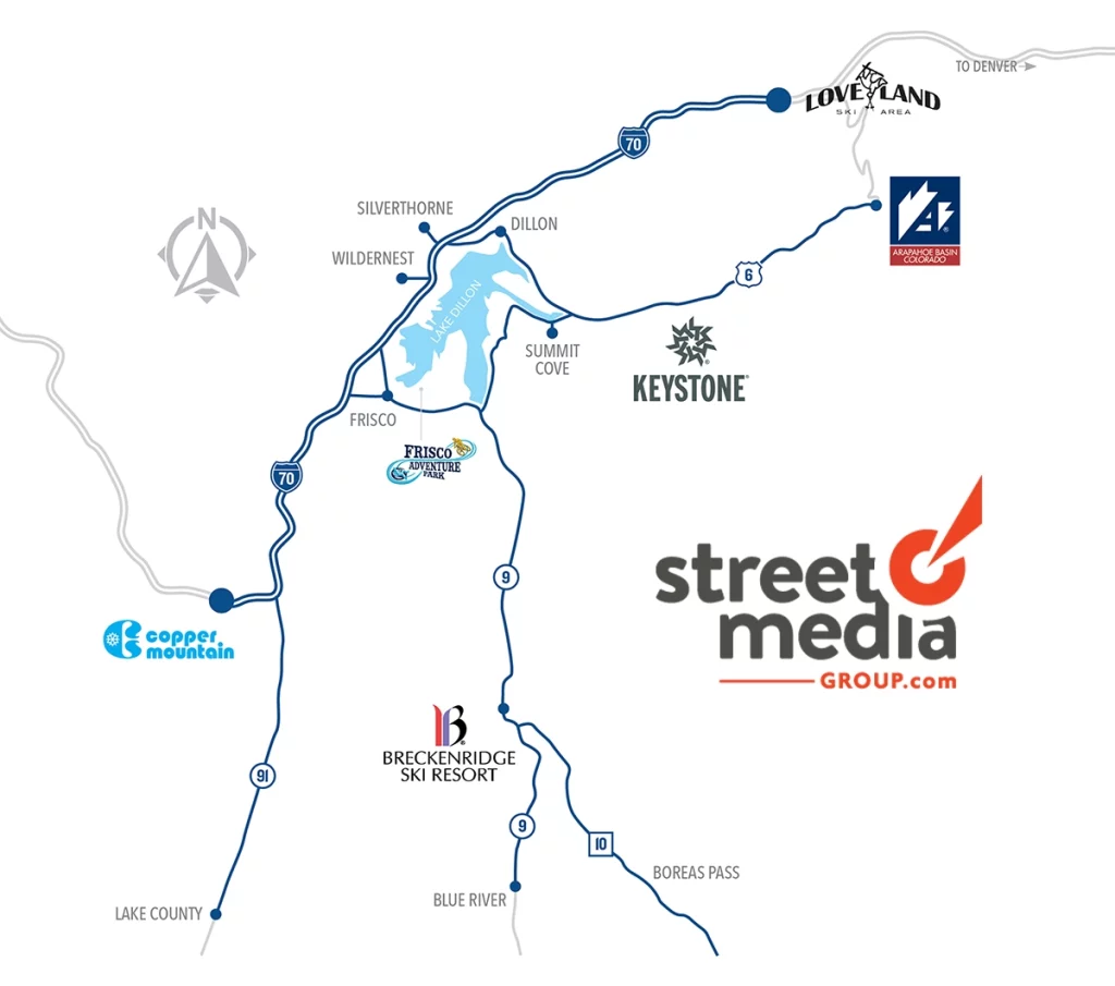
StreetMedia's Bus Advertising Products in Summit County
In Summit County, StreetMedia offers the following bus ad options: Interior Bus Cards, Kings & Queens, Tails, Larger than Life, King Kongs, Full Wraps.
Vail Valley Bus Advertising
Vail and Beaver Creek Ski Resorts headline some of the most exciting attractions in the Vail Valley, bringing throngs of visitors from all around the world. With an extensive bus transit system, our ads travel throughout both of these resort destinations, along with surrounding areas like Avon, Eagle, and Gypsum.
Home to Vail and Beaver Creek ski resorts, the Vail Valley attracts millions of tourists and attractive demographics. A lengthy list of additional attractions offer year-round fun, such as whitewater rafting around Glenwood Canyon, Chamber’s Park Local Historical Museum, Centennial Park, Eagle River Pool & Ice Rink, trailheads for mountain bikers, trail runners, and hikers, a BMX track, fishing at Sylvan Lake State Park, and world-class views at Eagle Ranch Golf Club. Top notch shopping and restaurants are at the ready for those interested in a different kind of adventure. And the Eagle County Regional Airport stays busy all year bringing a steady supply notable tourists and consumers to the area.
StreetMedia's Bus Advertising Coverage Through Vail Valley
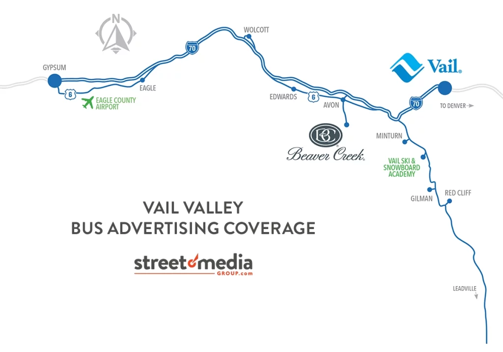
StreetMedia's Bus Advertising Products in the Vail Valley
StreetMedia offers Interior Bus Card advertising in the Vail Valley.

Pueblo Bus Advertising
We offer more of our OOH advertising product types in Pueblo than any of our other markets. Why? Because Pueblo continues to deliver large audiences of promising consumers. Our extensive network of billboards, benches, shelters, and bus ads provide remarkable coverage throughout the area. Each product has its own specific advantages, so reach out to one of our Account Executives today to learn which are right for your business.
Pueblo attracts tourists and popular demographics seeking iconic green-chile inspired dishes and outdoor adventures at Lake Pueblo Sate Park. Hiking trails, the Levee Murral project, Brues Alehouse, and the Historical Arkansas Riverwalk are some more of Pueblo’s popular attractions. All of this contributes to a community rich in culture, pulling local and regional tourism to Pueblo’s Creative Corridor, the Colorado State Fair, and the Chile & Frijoles festival. Colorado State University Pueblo also provides a large number of consumers for advertisers to target.
StreetMedia's Bus Advertising Coverage Through Pueblo
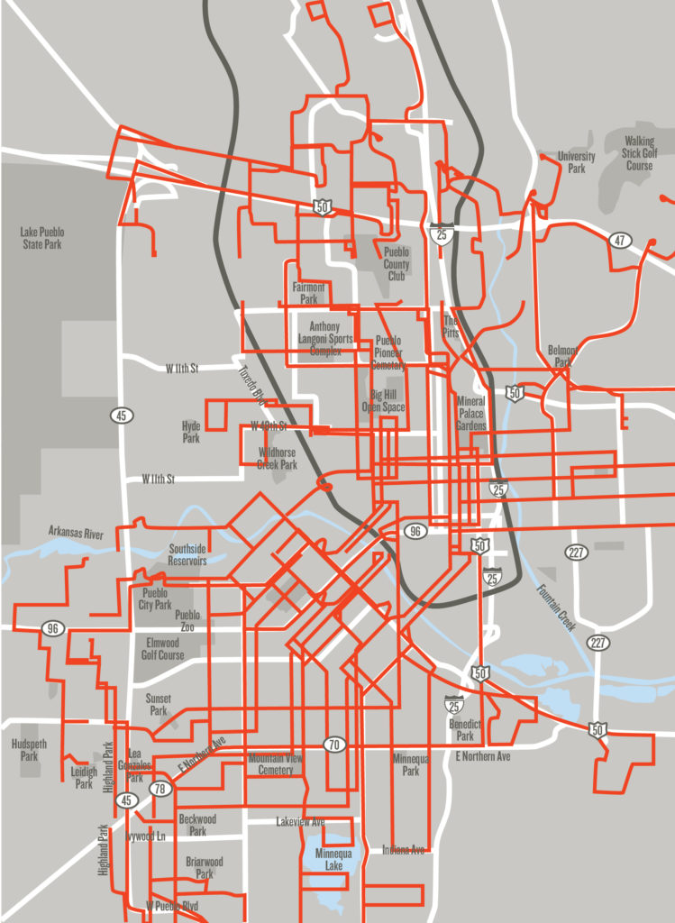
StreetMedia's Bus Advertising Products in the Pueblo
In Pueblo, StreetMedia offers the following bus ad options: Interior Bus Cards, Kings & Queens, Tails, Larger than Life, King Kongs, Full Wraps.

Bus advertising is a powerful tool because of its great exposure, localized reach, affordability and high visibility. With numerous interior and exterior display options, StreetMedia’s bus ads can effectively deliver marketing messages to a vast audience and generate widespread brand awareness. SMG offers some of the most attractive bus ad markets in Colorado, and a wide range of options to accommodate all budgets. Both local and national advertisers NEED to use SMG bus advertising if they want to reach the most attractive demographics and motivated consumers in Colorado.
